A redesign of the VR bank was long overdue to be fully accessible & to keep up-to-date with the latest design trends.
Atruvia AG, a subsidiary of the VR Bank Group and its primary IT provider, serves the Volksbanken Raiffeisenbanken network. Over an 18-month period, my primary task was to lead the redesign of the entire logout section of the VR-banking websites, focusing on both the logged-out and logged-in states. This project was part of a broader, long-overdue overhaul of multiple digital touchpoints, including the online banking platform, a B2B business management tool, and the website CMS.
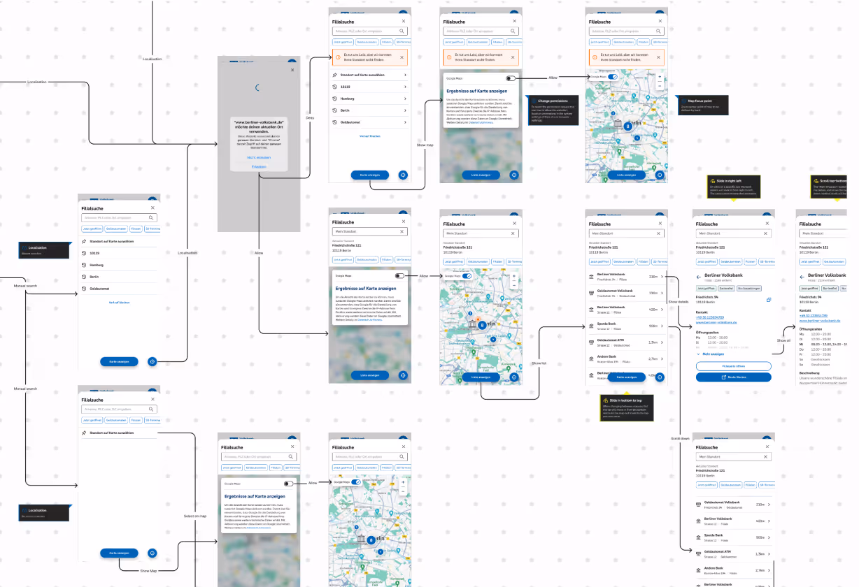
The existing system suffered from critical accessibility issues and an unintuitive user flow, with a particularly frustrating journey that could take over 10 clicks just for a user to reach the first relevant content when seeking housing credit. Given the low UX maturity within the organisation, another key objective was to enhance UX awareness and best practices within the teams. I was fully integrated into a classic SCRUM environment, collaborating closely with developers, product owners, and business analysts across three separate Scrum teams to manage the complexity of a fully customisable website builder for over 700 branches.
Atruvia AG, a subsidiary of the VR Bank Group and its primary IT provider, serves the Volksbanken Raiffeisenbanken network. Over an 18-month period, my primary task was to lead the redesign of the entire logout section of the VR-banking websites, focusing on both the logged-out and logged-in states. This project was part of a broader, long-overdue overhaul of multiple digital touchpoints, including the online banking platform, a B2B business management tool, and the website CMS.
The existing system suffered from critical accessibility issues and an unintuitive user flow, with a particularly frustrating journey that could take over 10 clicks just for a user to reach the first relevant content when seeking housing credit. Given the low UX maturity within the organisation, another key objective was to enhance UX awareness and best practices within the teams. I was fully integrated into a classic SCRUM environment, collaborating closely with developers, product owners, and business analysts across three separate Scrum teams to manage the complexity of a fully customisable website builder for over 700 branches.
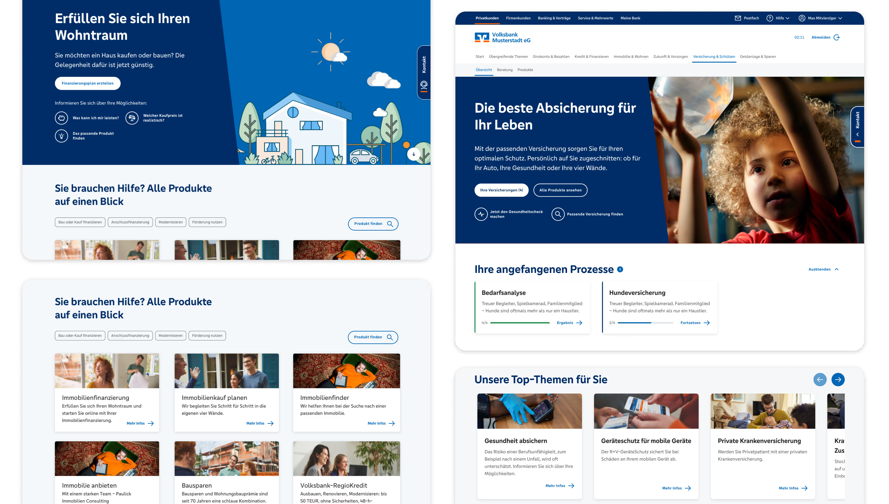
Successfully created multiple templates and components for over 700 individual banks, providing a flexible and consistent solution for use in a Content Management System (CMS).
Developed and designed a fully customisable navigation tool and a homepage test environment in conjunction with the CMS, specifically for editors.
Consulted with teams and clients to ensure seamless use of the provided components within the CMS. I also trained colleagues in Figma, helping to facilitate the company's switch from Sketch as the main design tool.
I led up to 3 product teams, ensuring quality assurance (QA) requirements were met and that our work remained aligned with the project goals. I also managed JIRA processes, created Story Templates, and implemented UX maturity within the teams.
Matching Stakeholder & User Needs: A primary challenge was to align stakeholder wishes and business goals with the needs of the end-user. This influenced certain design decisions and required careful negotiation to balance business objectives with optimal user experience.
Multiple Dependencies: The process involved many different teams—including Research, Design System, and multiple Scrum teams—which could cause delays and certain limitations. I had to proactively manage communication to keep the project on track.
Limited Testing Possibilities: User testing was a very long process and could lead to delays in development. This often required me to make key decisions based on experience and expertise.
Content Management System Inconsistencies: Due to the nature of a CMS, inconsistencies could prevail across the 700+ entities, such as with bad quality images or extremely long copy. It was impossible to fully control or avoid these issues, requiring me to design robust components that could handle these variations.
I began the design process with a kick-off workshop alongside the Product Manager, Product Owner, Business Analyst, and other key stakeholders. In this session, we defined the project's problem statement and identified two key business areas that had a high impact on revenue: housing credit and insurances. I also created a stakeholder map to identify and prioritise all relevant parties for continued feedback and input.
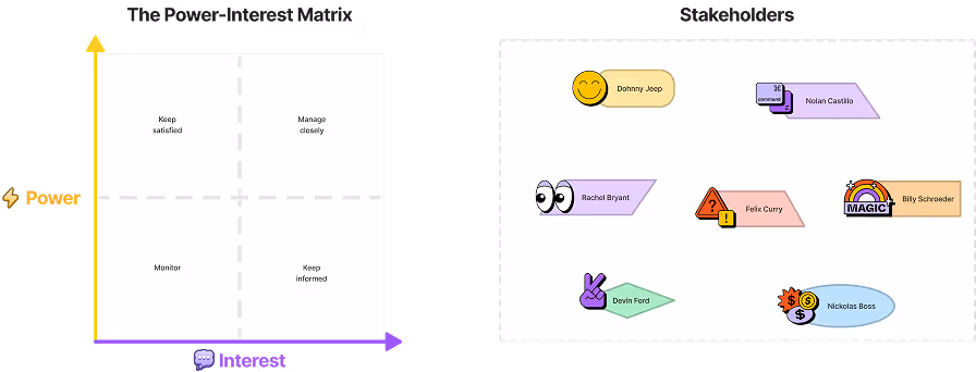
Stakeholder Map
To deeply understand our users' perspectives, I facilitated a workshop where we created empathy maps with stakeholders to define user pain points, needs, and goals. Following a collaborative brainstorming session, I evaluated the results to create multiple customer journey maps that meticulously detailed the current user flow. This exercise was critical in identifying specific bottlenecks and inefficiencies, and it enabled us to significantly decrease the number of clicks needed for users to reach their goals. Based on these insights, we also identified key opportunities, such as cooperating with comparison sites and offering a quick calculation guide to get a first idea and result in just 3-4 clicks.
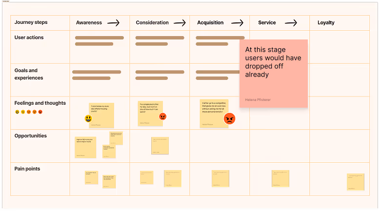
Customer Journey
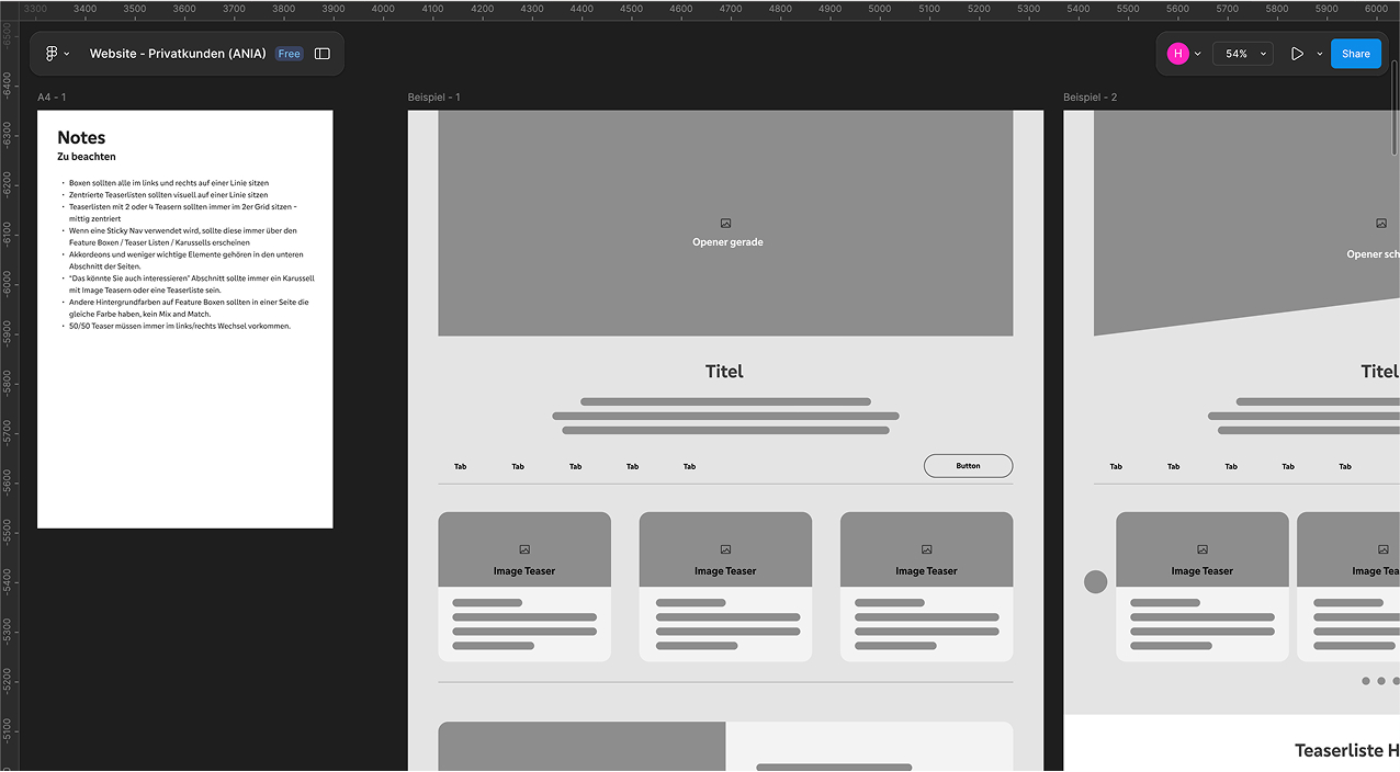
Initial Wireframes
Building on the research insights, I created initial wireframes for the housing credit and insurance examples. These were designed based on a scalable component style, which allowed for consistency and efficiency across the platform. I discussed the wireframes with stakeholders and iteratively improved the elements, ensuring the final designs also took into account the technical limitations of the new AEM Content Manager system. Whereas the main content was handled by the AEM CMS, two other building blocks were required in order to built the website: the Navigation Manager for custom navigation, and the Homepage Manager for customising the header and footer. These two blocks were fully incorporated into the B2B SaaS platform. All of these building blocks had to be flexible enough for over 700 individual banks to rebuild their websites while maintaining overall consistency. The following images will show examples of these three building blocks and how, ultimately, they play together.

This project was a major learning experience that allowed me to grow as both a designer and a leader. Key lessons I took away include:
Balancing Act: I learned how to effectively align the needs of end-users with the business goals of numerous stakeholders, finding a balanced solution that satisfied both.
Process over Perfection: When faced with a large, complex project and limited testing, I learned to rely on and advocate for strong internal processes, such as standardised JIRA templates and clear UX reviews, to ensure quality and mitigate delays.
Scalability is Key: I gained invaluable experience designing for scale, understanding that robust, flexible components are essential when a single design has to be adapted by hundreds of different entities.
This project was a major learning experience that allowed me to lead a large-scale, complex design initiative from start to finish. My work resulted in a new, scalable, and consistent design foundation for over 700 banks. This redesign not only provides a better, more intuitive experience for bank customers by significantly reducing a user's journey, but it also empowers bank editors with the tools to efficiently manage their digital presence.
